왜 Flexbox만으로는 부족했을까? Why grid?
ㅁ ㅁ ㅁ ㅁ ㅁ
ㅁ ㅁ
이렇게 오류가 생겨버리니까. 우리가 원한건
ㅁ ㅁ ㅁ ㅁ ㅁ
ㅁ ㅁ
이건데!
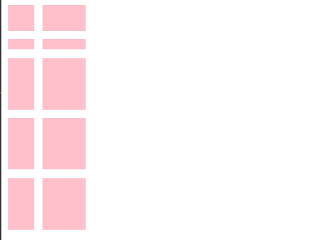
<style>
.father {
display: grid;
grid-template-columns: 30px 50px; // 첫번째 column width는 30px, 두번째 칼럼은 50px
grid-template-rows: 30px 12px; // // 첫번째 row height는 30px, 두번째 row는 50px
grid-gap: 10px
}
.box {
background-color: pink;
}
</style>
<body>
<div class="father">
<div class="box">1</div>
<div class="box">2</div>
<div class="box">3</div>
<div class="box">4</div>
<div class="box">5</div>
</div>
</body>
grid-auto-flow
추가적인 child component가 더해지는 방향. 기본적으로 row임.
예시
grid-auto-flow: row
grid-auto-flow: column

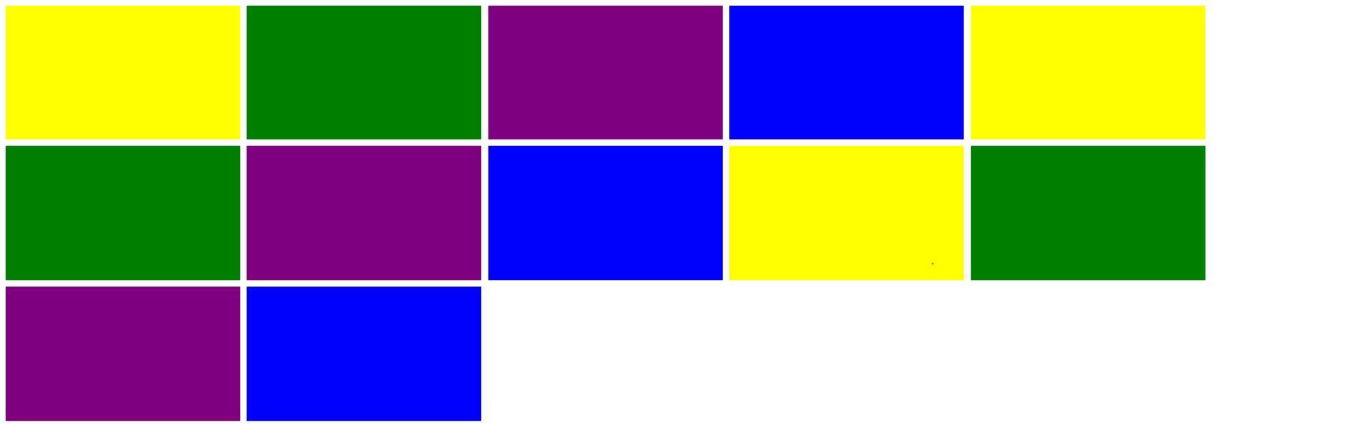
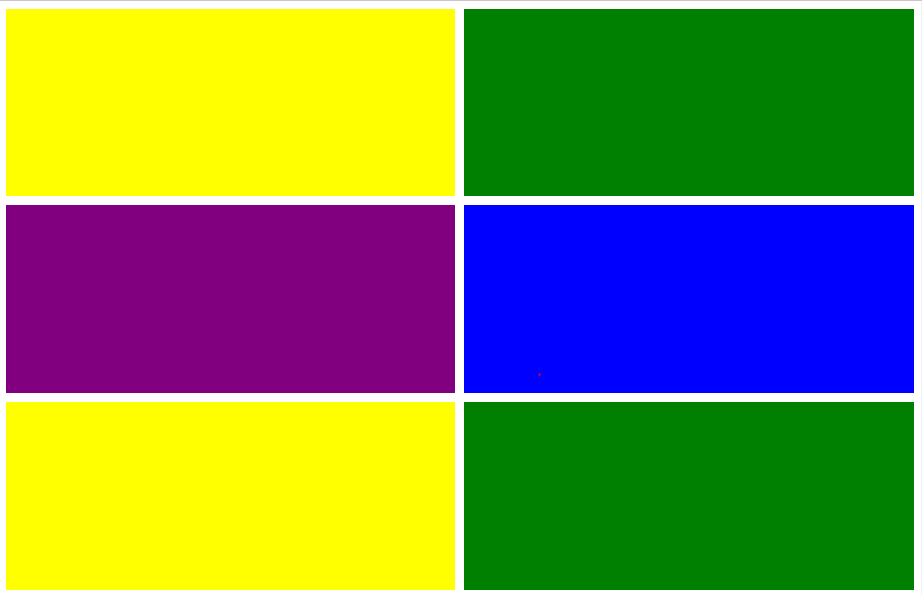
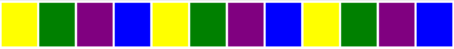
grid-template-area
자유로운 레이아웃을 위해!
<style>
.father {
display: grid;
grid-gap: 10px;
grid-auto-rows: 200px;
grid-template-areas:
"header header header"
"content content sidebar"
"content content sidebar"
"footer footer footer";
}
.first {
grid-area: header; // "header"라고 적지 않도록 주의
background-color: yellow;
}
.second {
grid-area: s;
background-color: green;
}
.third {
grid-area: footer;
background-color: purple;
}
.fourth {
grid-area: sidebar;
background-color: blue;
}
</style>
<body>
<div class="father">
<div class="first"></div>
<div class="second"></div>
<div class="third"></div>
<div class="fourth"></div>
</div>
</body>

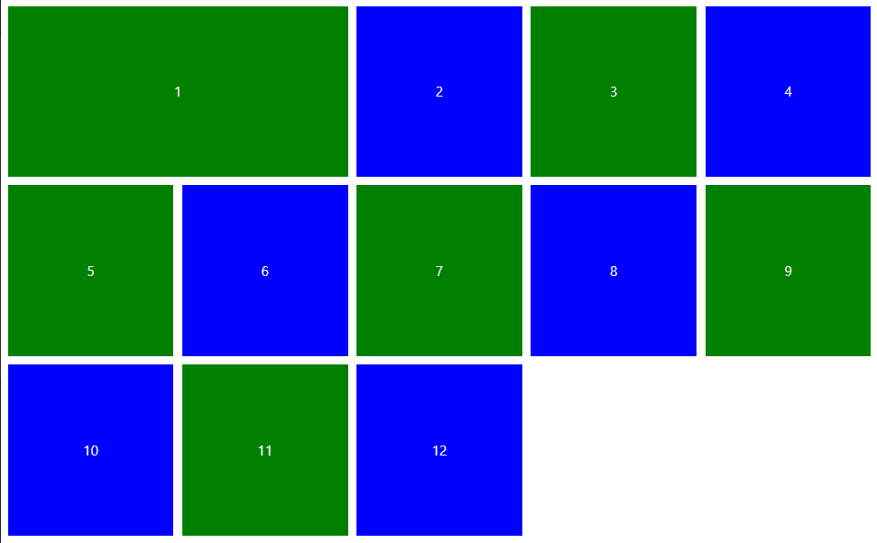
fr, repeat
fr: 반응형 디자인에서 각 컴포넌트의 비율 자동 계산시 유용
.father {
display: grid;
grid-gap: 10px;
grid-auto-rows: 200px;
grid-template-columns: 2fr 1fr 2fr 1fr;
}
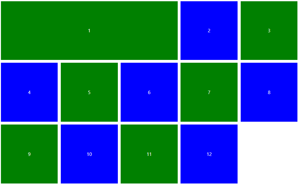
repeat
grid-template-columns: 1fr 1fr 1fr 1fr; -> grid-template-columns: repeat(4, 1fr);

minmax
컴포넌트의 최솟값과 최댓값 지정
grid-template-columns: minmax(400px, 2fr) repeat(3, 1fr);

max-content
grid-template-columns: max-content repeat(3, 1fr);
사용할 수 있는 공간 최대한 사용해라

min-content
grid-template-columns: min-content repeat(3, 1fr);
사용할 수 있는 공간 최소한 사용해라

grid-auto-rows: 200px; 없으면 overflow 사라짐.
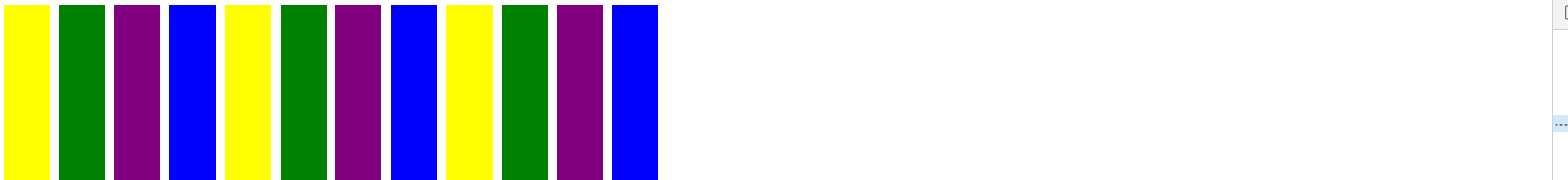
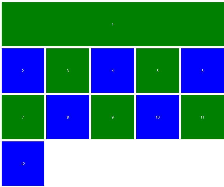
auto-fit
column 가져올 수 있는 만큼 최대한 한 줄에 넣어라.
grid-template-columns: repeat(auto-fit, 50px);

grid-template-columns: repeat(auto-fit, 350px);
minmax를 이용한 응용
grid-template-columns: repeat(auto-fit, minmax(350px, 1fr));
auto-fill vs auto-fit
auto-fill : ghost grid 생성
justify-content
main axis 따라서 정렬
.father {
display: grid;
grid-gap: 10px;
grid-auto-rows: 200px;
grid-template-columns: repeat(5, 50px);
justify-content: center; //start, end 도 이에 따라 위치 바뀜
}

align-content
main axis 따라서 정렬
.father {
display: grid;
grid-gap: 10px;
grid-auto-rows: 200px;
grid-template-columns: repeat(5, 50px);
justify-content: end;
align-content: center;
height: 100vh;
}
place-content
shorthand property.
place-content : center left; // 첫번째 요소는 align-content, 두번재 요소는 justify-content
place-items / justify-items / align-items
shorthand property.
.father {
display: grid;
grid-gap: 10px;
grid-auto-rows: 200px;
grid-template-columns: repeat(5, 50px);
place-items: end center;
height: 100vh;
}
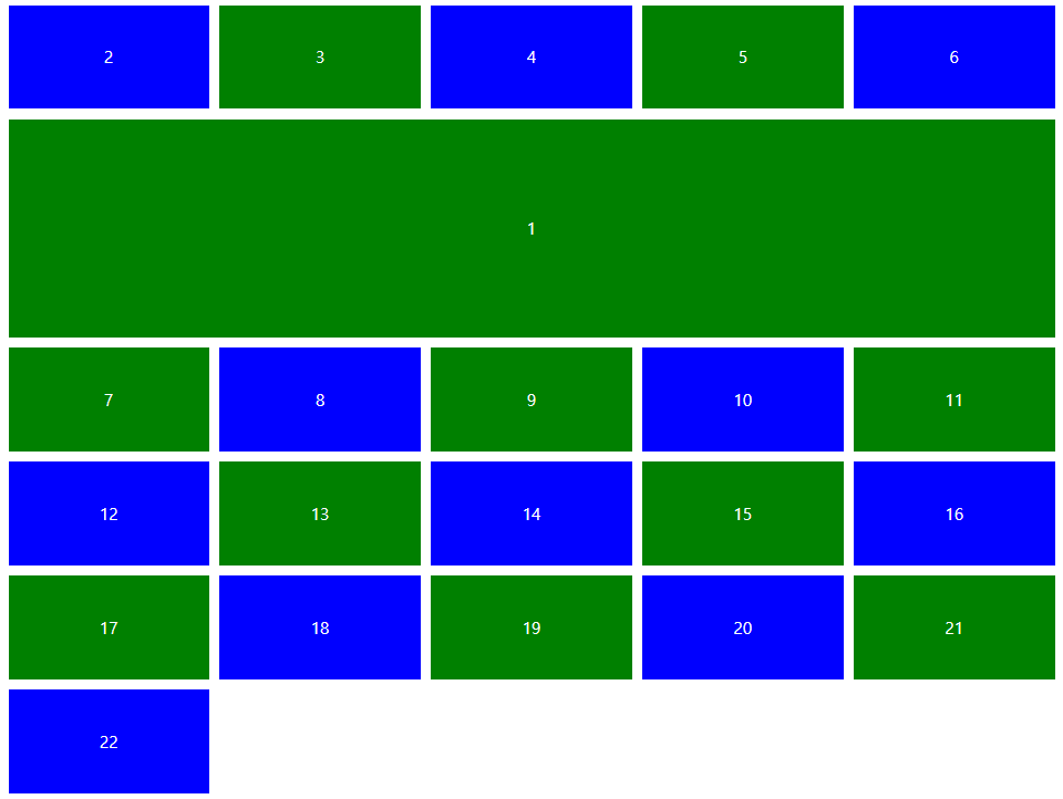
grid-column
grid-colum : 1 / 3
1: 시작 line
3: 끝나는 라인
.father {
display: grid;
grid-gap: 10px;
grid-auto-rows: 200px;
grid-template-columns: repeat(5, 1fr);
}
.box {
display: flex;
justify-content: center;
align-items: center;
color: white;
}
.box:nth-child(even) {
background-color: blue;
}
.box:nth-child(odd) {
background-color: green;
}
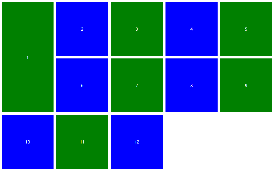
.box:first-child {
grid-column: 1 / 3;
}
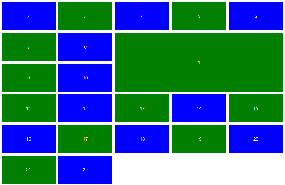
grid-column-start / grid-column-end
.box:first-child {
grid-column-start: 1;
grid-column-end: 4;
}
--> shorthand property --> grid-colum : 1 / 4
Tip: 마지막 라인 번호를 모를때, 1번 박스를 전체에 꽉 차게 하고 싶다면
.box:first-child {
grid-column-start: 1;
grid-column-end: -1;
}
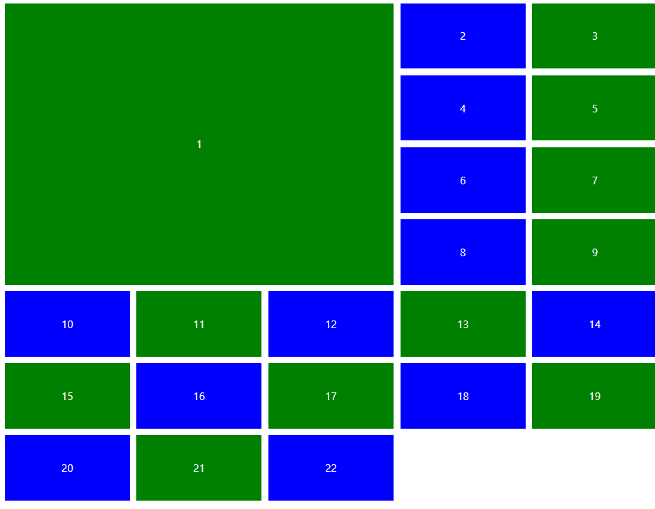
.box:first-child {
grid-row-start: 1;
grid-row-end: 3;
}
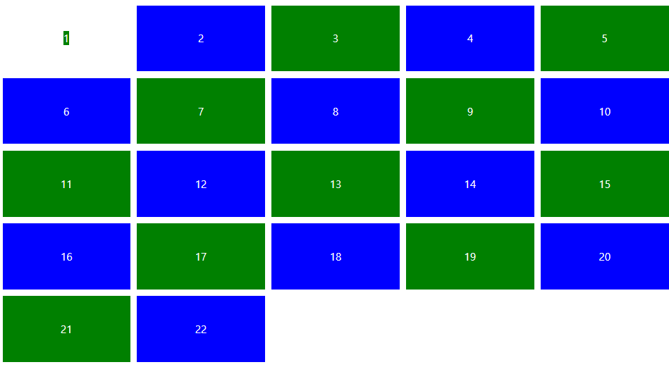
line naming
특정 라인에 접근하고 싶을때
주의 :
모든 라인 이름은 []으로 둘러싸여야 한다. 또한 그 이름 안에는 스페이스가 없어야하며, 필요할 경우 하이픈(-)으로 처리해야 한다.
.father {
display: grid;
grid-gap: 10px;
grid-auto-rows: 200px;
grid-template-columns: [a] 1fr [b] 1fr [c-1] 1fr [d] 1fr [e] 1fr [f];
}
.box:first-child {
grid-column-start: b;
grid-column-end: d;
}
grid-auto-flow
.father {
display: grid;
grid-gap: 10px;
grid-auto-rows: 200px;
grid-auto-flow: row dense;
grid-template-columns: [a] 1fr [b] 1fr [c-1] 1fr [d] 1fr [e] 1fr [f];
}
grid-column / grid-row
어디서부터 어디까지라고 말하는것도 귀찮다면!
.box:first-child {
grid-row: span 4;
grid-column: span 3;
}
grid-area
grid-row, grid-column의 예시
row start / column start / row end / column end 의 순서로 흘러감.
.box:first-child {
grid-area: 2 / 1 / 4 / -1;
}
.box:first-child {
grid-area: 2 / span 3 / 4 / -1;
}
align-self / justify-self / place-self
.box:first-child {
justify-self: center;
align-self: center;
}
.box:first-child {
place-self: center;
}
'Archived > CSS' 카테고리의 다른 글
| nth child의 의미 (0) | 2019.10.25 |
|---|---|
| list의 첫번째 child 빼고 hover effect 주고싶을 경우 (0) | 2019.10.24 |
| Flexbox (0) | 2019.10.23 |
| ease-in, ease-out / forwards / animation-delay / box-shadow / overflow-wrap (0) | 2019.10.21 |
